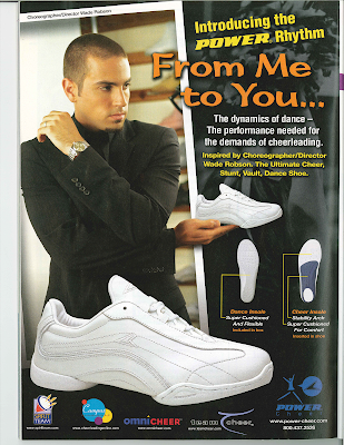
 Found this ad in a copy of American Cheerleader that our old Training Project Manager used to receive. Why did he receive American Cheerleader? I don't know. What does our Training Department do with American Cheerleader? Well, a big part of training is teamwork, so perhaps it's a reference tool. Why was I reading American Cheerleader? Let's just say, some trips to the bathroom take longer than others.
After looking at this ad for a while, most of it eventually made sense to me, but have a look see at what hung me up.
1) Now the ad placement makes perfect sense. It's a cheerleading sneaker in a cheerleading magazine. Score one for Power Cheerleading Shoes.
2) With all of the logos at the bottom and the headline dominating the top half of the picture, it took me a while to figure out exactly what the brand was and what the shoe was called. But this is a magazine for cheerleaders, so I'm guessing most of them would know. Push.

3) Why is there some overly serious guy in a black on black suit so awkwardly presenting this shoe to the cheerleading ether? Wait, that must be Choreographer/Director Wade Robinson noted in a tiny font above the picture and again in the fourth largest font on the page below the subhead. Again, I'm guessing cheerleaders would get this, but it still looks weird. I feel this could've made more sense, but Push.
4) One feature they don't note in the copy is the sneaker's ability to help you levitate other sneakers. A dodgy PhotoShop job has perched the sneaker
 perfectly on Choreographer/Director Wade Robinson's fingertips. Ah, PhotoShop, hand-in-hand with Stock Photos makes our creative lives so much easier as we heap hours of time onto our graphic designers. But at times people can get way too PhotoShop happy or simply hack up an image in the interest of trying to make something work. Know when to stop and you're Matisse. Forget that good art means eventually putting down the brush and you could end up with something that looks like plastic surgery addict Jocelyn Wildenstein (warning: freaking frightening cat lady).
In the end, this ad for Power Cheerleading Shoes works for this magazine and this market, but a few tweaks (like with most art) could've made it much better. I wish the same could be said for The Big Bang Theory. ZING! Honestly, I want those 10 minutes of my life back. Not one laugh. Not one laugh. It's supposed to be a freakin' comedy. I'm sorry. I got carried away. But seriously, please cancel it. Give me reruns of Hee Haw or Quincy M.E. with Jack Klugman or something. Okay, I'm done.
-Captain Awesome, Copywriter
